Fusedash vs Plottie
Side-by-side comparison to help you choose the right AI tool.
Fusedash turns your raw data into clear dashboards and charts so your team can act on insights instantly.
Last updated: March 3, 2026
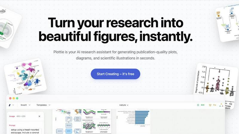
Effortlessly create publication-quality scientific figures and illustrations in seconds, no coding needed with Plottie.
Last updated: February 26, 2026
Visual Comparison
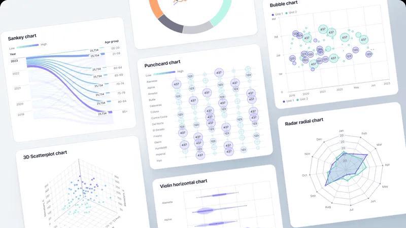
Fusedash
Plottie
Feature Comparison
Fusedash
Flexible Multi-Format Views
Fusedash understands that different stakeholders need information presented in different ways. That's why you can take a single, connected dataset and instantly present it as an executive KPI dashboard, a detailed chart for analysis, an interactive map for geo-analysis, or a narrative report with storytelling context. This flexibility eliminates the back-and-forth of creating custom reports for each audience, saving time and ensuring message consistency. You can customize layouts, apply universal filters, and set time ranges that work for each team's needs.
AI-Powered Chart Generator
Jumpstart your data storytelling with the AI chart generator. Simply upload a CSV or connect to an API, and Fusedash helps you create clear, effective visuals in minutes. The AI assists in selecting the most appropriate chart type for your data, applying meaningful comparisons, and refining labels to ensure the visual accurately tells your story. These charts can be used as powerful standalone assets for presentations or seamlessly dropped into larger dashboard views for comprehensive reporting.
Integrated AI Chat & Assistance
When you're exploring data and aren't sure where to begin, Fusedash's Smart Chat is your guide. Ask questions about your data in plain, natural language—like "What were sales in the northwest region last quarter?"—and get instant answers, suggested breakdowns, and recommendations for relevant metrics or charts. You can then instantly turn these insights into a new, shareable dashboard view, dramatically speeding up the journey from question to actionable visual report.
Unified Data Integration & Reusability
Stop rebuilding the wheel every time you need a report. Fusedash lets you bring data together from various sources—upload CSVs, connect directly to live APIs, or enrich your analysis with public datasets—all within one platform. Once connected, you can combine these datasets for a unified view and, most importantly, reuse the same prepared data and KPI definitions across countless charts, dashboards, and reports. This creates a single source of truth and ensures your metrics are always calculated consistently.
Plottie
AI-Powered Plot Generation
Plottie's AI editor allows users to create tailored visualizations effortlessly. By simply describing the desired figure in plain language, users receive polished, editable results that can be fine-tuned on an interactive canvas, making figure creation straightforward and efficient.
Extensive Library of Visuals
Access a vast repository of over 100,000 high-quality plots from prestigious journals such as Nature and Science. This extensive library serves as a valuable resource for inspiration, enabling users to explore various scientific visualizations across multiple disciplines.
Smart Data Analysis
Plottie automatically analyzes uploaded datasets to recommend the most suitable visualizations. By detecting data types and variable relationships, it guides users in choosing the best plot for their scientific story, reducing the guesswork involved in data representation.
Infinite Canvas Workspace
Plottie features a zoomable, infinite canvas that allows users to organize multiple plots and diagrams seamlessly. This workspace supports creative freedom, enabling you to arrange and auto-align your visualizations, making it ideal for drafting comprehensive papers or presentations.
Use Cases
Fusedash
Executive KPI Review Dashboards
Leadership teams need a high-level, real-time view of business health without getting lost in the weeds. Fusedash enables the creation of clean, focused dashboards that aggregate key performance indicators from across the organization. Executives can monitor trends, filter by department or region, and quickly drill down when a metric changes to understand the underlying drivers, all from a single, always-updated view.
Marketing & Revenue Performance Tracking
Marketing and sales teams can use Fusedash to track campaign performance, pipeline health, and revenue metrics in one place. By connecting data from CRM, ad platforms, and web analytics, teams can build dashboards that show ROI, lead generation trends, and conversion rates. The storytelling feature is perfect for adding context to weekly reports, explaining what changed and what the next actions should be.
Operations & Real-Time Monitoring
For teams where minutes matter, such as IT, logistics, or customer support, Fusedash's real-time interfaces are essential. Connect to live APIs and databases to monitor fast-moving metrics like system uptime, transaction volumes, or support ticket backlogs. Set up alerts and visualizations that update instantly, allowing teams to identify and react to issues as they happen, ensuring smooth operational continuity.
Geographic Analysis with Map Visualizations
Businesses with a physical or regional component can leverage Fusedash's built-in map visualizations. Plot store performance, customer density, shipment logistics, or service coverage areas on interactive maps. This geo-analysis makes spatial patterns immediately obvious, helping with territory planning, resource allocation, and market expansion strategies by visually answering the "where" behind the data.
Plottie
Grant Proposal Preparation
Researchers can utilize Plottie to create compelling visualizations for grant proposals, effectively communicating their research ideas and methodologies. High-quality figures enhance the overall presentation and can significantly improve the chances of funding.
Conference Poster Design
When preparing for academic conferences, Plottie helps users generate eye-catching posters that stand out. With its easy-to-use tools, researchers can create visually appealing diagrams and charts that convey complex information in an accessible format.
Manuscript Submission
Plottie is invaluable for academics looking to submit papers to journals. By transforming raw data into publication-ready figures, it streamlines the manuscript preparation process, ensuring that visual elements meet high academic standards.
Educational Presentations
Students and educators can leverage Plottie to develop informative and engaging presentations. The platform's intuitive interface allows for quick creation of illustrations that enhance learning and facilitate better understanding of complex scientific concepts.
Overview
About Fusedash
Fusedash is an AI-powered data visualization platform designed to help teams transform their connected data into clear, actionable insights. It acts as a unified workspace where you can create decision-ready dashboards, interactive charts, detailed maps, and narrative reports without the need to rebuild the same logic across multiple, disconnected tools. The core value proposition is consistency and efficiency: you define your key metrics and KPIs once, and then reuse those consistent definitions across every view and report. This ensures everyone in the organization—from leadership to marketing to operations—is looking at the same trusted numbers. Fusedash is built for teams that are tired of manual reporting cycles and conflicting data stories. It empowers users to not only monitor what's happening through real-time interfaces but also to understand why it's happening by drilling down into segments, regions, or time periods. With integrated AI features like natural language data chat and smart visualization assistance, Fusedash makes data exploration and reporting faster and more accessible, turning raw data into a shared source of truth that drives alignment and action.
About Plottie
Plottie is a free, AI-powered platform tailored for researchers, students, and academics seeking to create high-quality scientific figures with minimal effort. By leveraging a curated database of over 100,000 plots sourced from open-access journals, Plottie provides users with a wealth of inspiration for their manuscripts. Its intelligent AI editor allows users to generate publication-ready figures from scratch with just a few descriptive words, eliminating the need for complex coding or expensive software licenses. Whether you need scatter plots, heatmaps, or bar charts, Plottie simplifies the visualization process, allowing you to focus on your research. The platform's multi-model backend support—including Claude, Gemini, and GPT—ensures that the figures are not only visually appealing but also scientifically accurate. With seamless export options to PNG, PDF, or SVG, Plottie is your all-in-one solution for transforming raw data into visually stunning illustrations ready for publication.
Frequently Asked Questions
Fusedash FAQ
What kind of data sources can I connect to Fusedash?
Fusedash offers flexible data integration options to suit various needs. You can start quickly by uploading CSV or Excel files directly. For live, updating data, you can connect to countless applications and databases via their APIs. The platform also supports enriching your views with public datasets, which is especially useful for adding geographic or market context to your internal data.
How does the AI Chat feature actually work?
The AI Chat, or Smart Chat, acts as an intelligent assistant within your data. You type questions in natural language, just as you would ask a colleague, such as "Show me monthly revenue for product X." The AI interprets your question, queries the connected dataset, and provides an answer in text form. It can also suggest the best way to visualize that answer—recommending a chart type or a new dashboard view—which you can then create with a single click.
Can I share the dashboards and reports I create with people outside my team?
Absolutely. A key function of Fusedash is to facilitate easy sharing and alignment. You can generate shareable links to your dashboards, charts, or narrative reports. Recipients can view the interactive visualizations, apply filters, and explore the data without needing a Fusedash account, making it simple to keep stakeholders, clients, or leadership informed with the latest insights.
Is Fusedash suitable for real-time data monitoring?
Yes, Fusedash is built to handle real-time monitoring scenarios. By connecting to live API data sources, you can create interfaces and dashboards that refresh at intervals you define—even as frequently as every minute. This is ideal for operational teams that need to monitor system health, live sales data, or social media mentions, allowing them to see changes and react promptly.
Plottie FAQ
Is Plottie free to use?
Yes! Plottie offers a generous free tier that enables users to generate an unlimited number of plots and export them in standard quality. For those needing high-resolution vector exports and advanced AI features, Pro plans are available.
Which AI models does Plottie use?
Plottie employs domain-specific AI models that are fine-tuned on scientific literature and datasets. This ensures that the generated visualizations are scientifically accurate, addressing the specific needs of researchers rather than providing generic outputs.
Do I own the copyright to the images generated?
Absolutely! Users retain 100% ownership rights to all images and charts created with Plottie. These assets are royalty-free and can be incorporated into academic publications, posters, and presentations without additional permissions.
Is my uploaded data used to train your AI?
No, your data privacy is a top priority for us. Uploaded datasets are not used to train our AI, ensuring that your information remains confidential and secure while you utilize Plottie's capabilities for your research needs.
Alternatives
Fusedash Alternatives
Fusedash is an AI-powered analytics and data visualization platform. It helps teams build dashboards, track KPIs, and generate narrative reports from their connected data sources. The platform is designed to provide consistent, decision-ready insights across an organization. Users often explore alternatives for various reasons. This could be due to specific budget constraints, the need for different integration capabilities, or a desire for features tailored to a particular industry or team size. The search for the right tool is a normal part of finding the perfect fit for a company's unique data stack and workflow requirements. When evaluating other options, consider your core needs. Key factors often include the ease of connecting to your data sources, the flexibility of visualization and reporting, the role of AI and automation features, and the overall user experience for both analysts and business stakeholders. It's also wise to assess the scalability and security standards of any platform you consider.
Plottie Alternatives
Plottie is an innovative, AI-powered platform designed for generating professional scientific figures tailored for researchers, students, and academics. As a part of the AI Assistants and Data Visualization categories, Plottie simplifies the creation of high-quality plots, making it accessible to users without coding expertise. Users often seek alternatives to Plottie for various reasons, including specific feature requirements, budget constraints, or compatibility with different platforms. When choosing an alternative, it's essential to consider factors such as ease of use, the variety of supported visualizations, and the level of customization available, ensuring that the tool meets your unique research needs.