Puzzly vs StatPecker
Side-by-side comparison to help you choose the right AI tool.
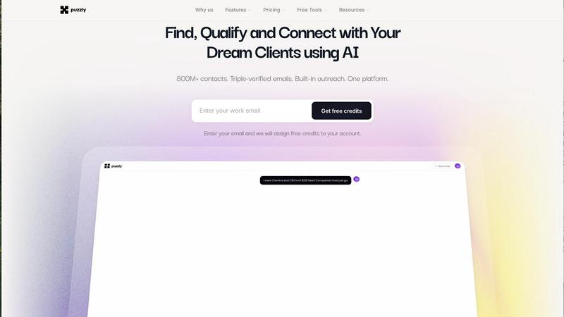
Find, Qualify and Connect with Your Dream Clients using AI

StatPecker gives you fast, private AI insights and stunning visuals from your data.
Last updated: March 1, 2026
Visual Comparison
Puzzly
StatPecker
Overview
About Puzzly
Puzzly is an AI-powered customer intelligence platform that helps businesses detect, find, and connect with their ideal consumers.
Puzzly leverages advanced artificial intelligence to identify high-intent prospects, uncover actionable insights, and streamline outreach across channels. By combining real-time data analysis with intelligent targeting, Puzzly enables companies to increase conversion rates, improve marketing efficiency, and accelerate revenue growth.
Businesses use Puzzly to refine audience targeting, personalize engagement, and align sales and marketing teams around high-value opportunities. Built with privacy and security in mind, Puzzly prioritizes responsible data practices while delivering scalable, performance-driven solutions.
For more information about how Puzzly helps companies discover the right consumers, optimize outreach, and grow faster, visit: www.puzzly.ai
About StatPecker
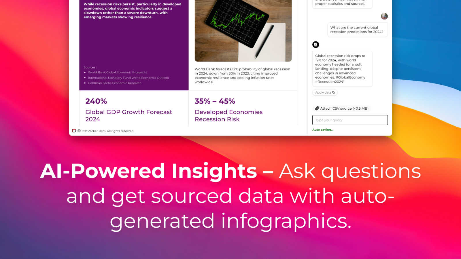
StatPecker is your friendly AI-powered sidekick for transforming boring numbers into beautiful, insightful stories. At its heart, it's a smart data visualization tool that takes raw data—whether from online sources or your own CSV files—and turns it into engaging infographics, charts, and reports in seconds. It's built for anyone who needs to communicate data clearly and compellingly, without needing a degree in design or data science. Think of content creators looking to spice up their blog posts, marketers needing to showcase campaign results, educators simplifying complex topics for students, or business analysts who want to share insights quickly with their team. The core value of StatPecker is its simplicity and power: you ask a question or upload your data, and it handles the heavy lifting of analysis and design, saving you hours of manual work in tools like spreadsheets or graphic editors. It’s about making data storytelling accessible, fast, and impactful for everyone.