Best Data Visualization AI tools (4+)
Discover 4+ best data visualization AI tools. Compare features, pricing, and reviews. Free and paid options available.
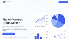
Graph Maker
Create professional graphs and charts in seconds.

ChatFlowchart
Transform your text into professional flowcharts and diagrams with ChatFlowchart's intuitive AI chat interface.
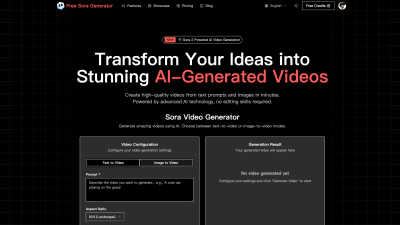
Free Sora Generator
FreeSoraGenerator lets you create Sora AI videos from text or images instantly and for free.

conceptviz
Transform your science ideas into clear, ready-to-use diagrams in seconds for classrooms and research.
FAQs for Data Visualization
How does the Data Visualization Category improve data comprehension?
The Data Visualization Category significantly improves data comprehension by transforming complex datasets into visual formats like charts and graphs. This visual approach allows users to quickly identify patterns, trends, and outliers, facilitating a deeper understanding of the information at hand. By making data more accessible and engaging, it aids in effective communication and informed decision-making, addressing the challenge of interpreting large volumes of data.
What unique features does the Data Visualization Category offer?
The Data Visualization Category offers unique features such as interactive dashboards and real-time data updates. These functionalities enhance user engagement and ensure timely access to the latest information. They empower users to analyze data trends more dynamically and make informed decisions based on current insights, significantly boosting the overall effectiveness of data analysis.
How can the Data Visualization Category enhance reporting?
The Data Visualization Category enhances reporting by providing tools that allow users to create compelling visual stories with their data. By utilizing graphs, charts, and infographics, reports become more engaging and easier to understand, enabling stakeholders to grasp insights quickly. This feature strengthens communication and supports effective decision-making by presenting critical information in an accessible format.
What competitive advantages does the Data Visualization Category provide?
The Data Visualization Category provides competitive advantages through its ability to turn complex data into visually appealing and actionable insights. Features like interactive elements and custom visualizations set it apart, allowing organizations to differentiate themselves by presenting data clearly and attractively, ultimately leading to better decision-making and strategic initiatives.
How does the Data Visualization Category support strategic decision-making?
The Data Visualization Category supports strategic decision-making by enabling users to analyze and interpret data visually, which reveals insights and trends that may not be immediately apparent in raw data formats. This enhanced visibility allows decision-makers to adjust strategies proactively and make data-driven choices that can lead to improved business outcomes.
In what ways can users maximize the benefits of the Data Visualization Category?
Users can maximize the benefits of the Data Visualization Category by utilizing its interactive features, customizing visualizations to suit their audience, and incorporating real-time data updates. These practices not only enhance the clarity of the insights presented but also improve user engagement and ensure that decisions are based on the most current and relevant information available.
You may also like
Marketing
The Marketing Category simplifies digital campaigns, offering essential tools for marketers.
Career & Jobs
The Career & Jobs Category is essential for job seekers, providing listings and advice.
Social Media
Explore the Social Media Category for tools that streamline engagement and content creation.
E-commerce
E-commerce Category provides robust tools for online sales, enhancing business growth.
Knowledge Management
The Knowledge Management Category streamlines knowledge sharing for better collaboration and decision-making.
Tech Tools
Explore the Tech Tools Category, designed to boost efficiency and productivity.
Other
The "Other Category" allows users to discover unique AI tools not fitting standard classifications.
Business Intelligence
The Business Intelligence Category empowers effective decision-making through data insights, enhancing competitiveness.